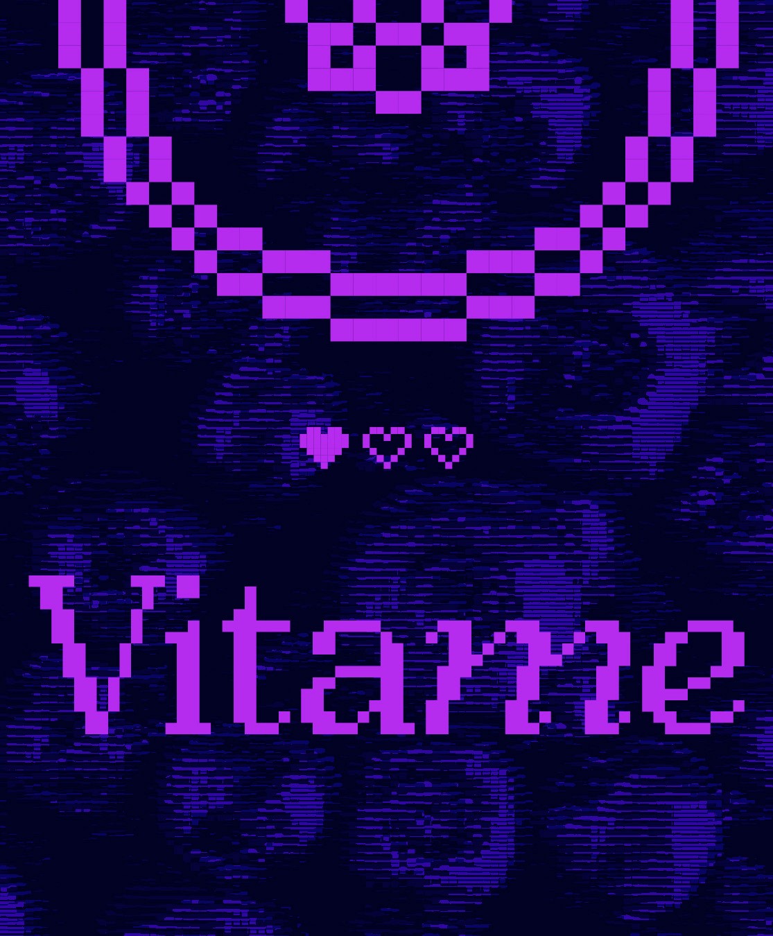
Vitame
A pixel-game-inspired cold-pressed juice brand that
reimagines everyday wellness as a playful, visual “power-up” for your day
Brief
Vitame is a conceptual cold-pressed juice brand designed to make everyday wellness feel more engaging and approachable. The project explores how a strong visual system can cut through a crowded health-drink market by using playful storytelling rather than traditional wellness cues.
The goal was to create a packaging identity that:
Clearly communicates 100% natural ingredients
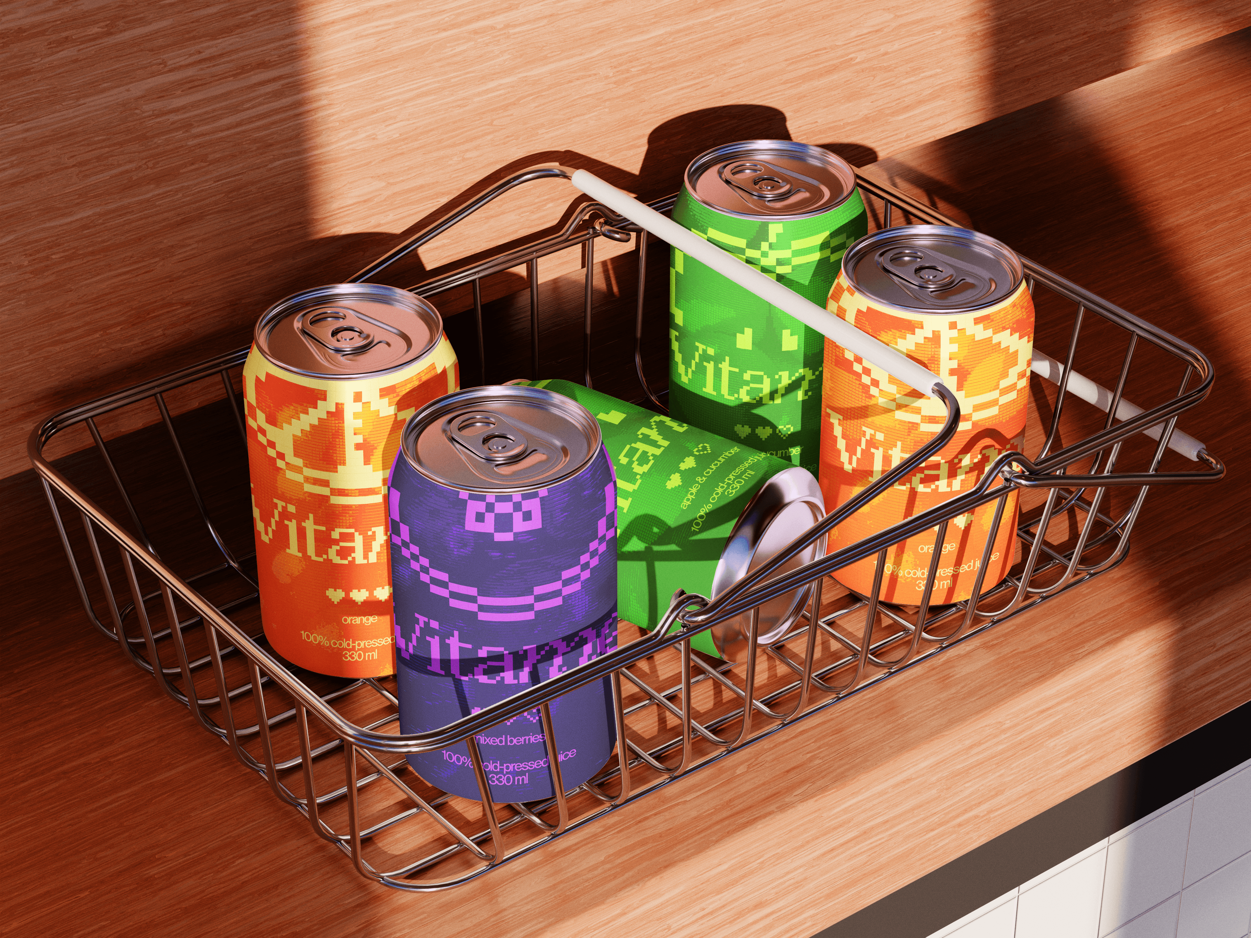
Uses bold colours and graphic clarity to stand out on shelf
Connects with a digitally native audience through familiar cultural references
Scales easily across flavours and formats
Concept
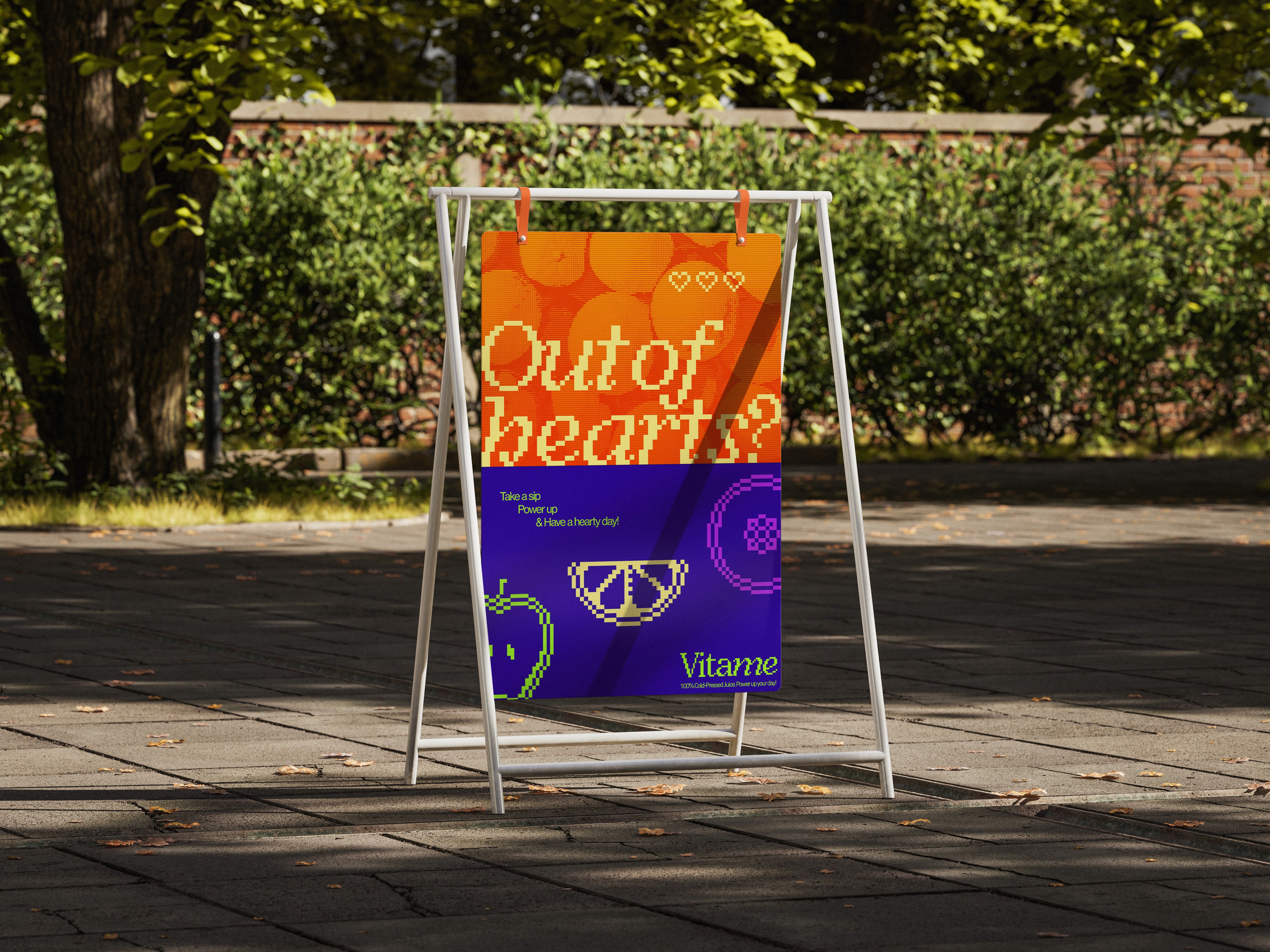
Vitame is inspired by the visual language of retro pixel games, where hearts represent health and energy. This idea is translated into a modern brand metaphor: each drink acts as a small daily recharge.
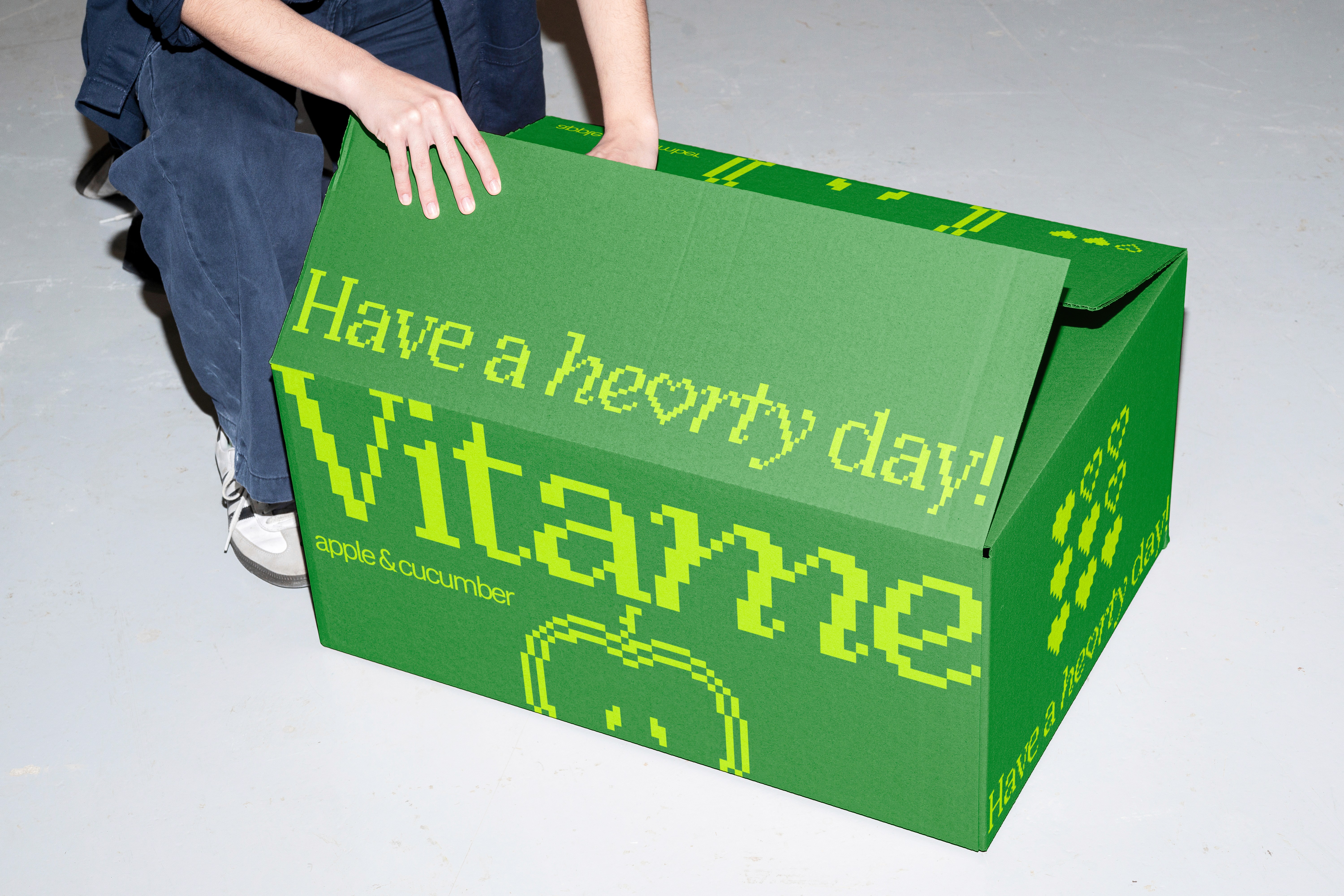
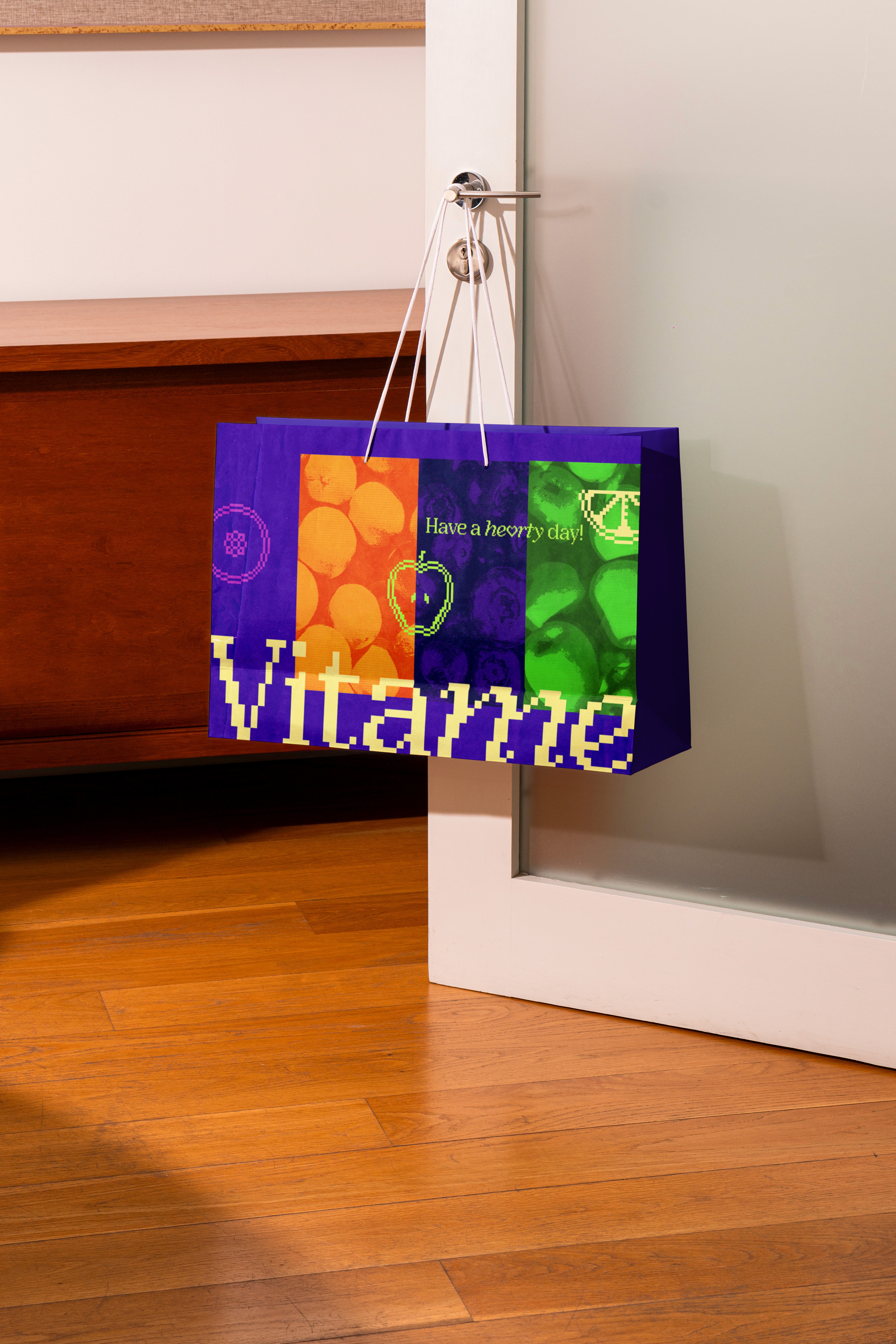
The identity uses bright, high-contrast colours, pixel-style graphics, and simplified icons to create a system that feels energetic, friendly, and easy to recognise. Heart motifs become a key brand asset, reinforcing the idea of vitality without relying on conventional wellness imagery.
Skillsets
Photoshop
After Effects
Illustrator
Lightroom
Animation
Storytelling
Social Media
Video Editing
Visual Identity
Layout
Colour Grading
Role
Solo Project by Rachel Leung

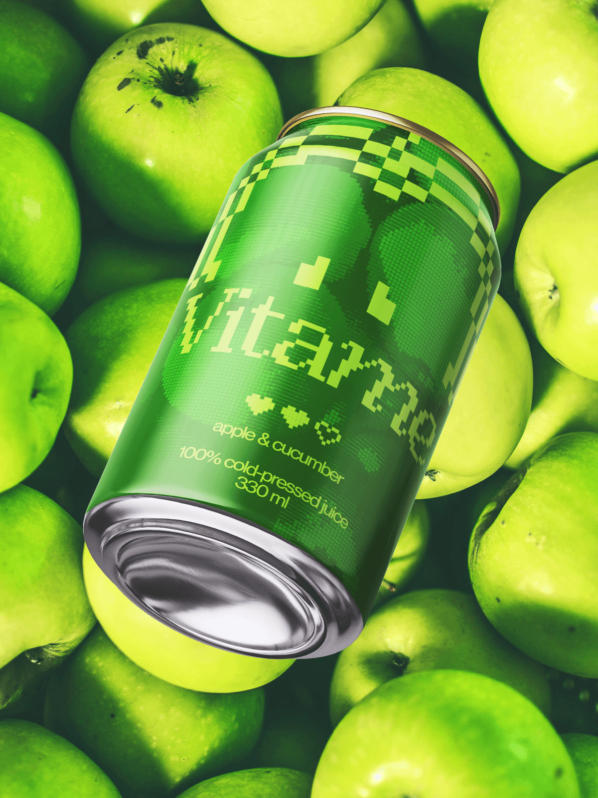

How can we make wellness approachable?
Brand Visuals
Vitame’s visuals use bold colour and playful symbols to make wellness feel light and rewarding. Inspired by pixel games and heart icons, the design creates an instant sense of energy and positivity — turning a healthy choice into a small moment of joy.
Wellness is often communicated through control and discipline. Vitame reframes it as something playful, visual, and easy to engage with.
