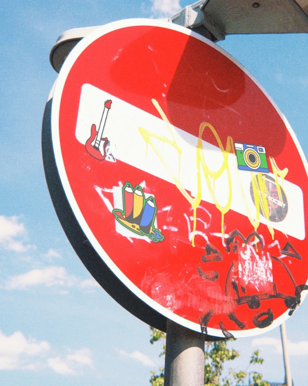
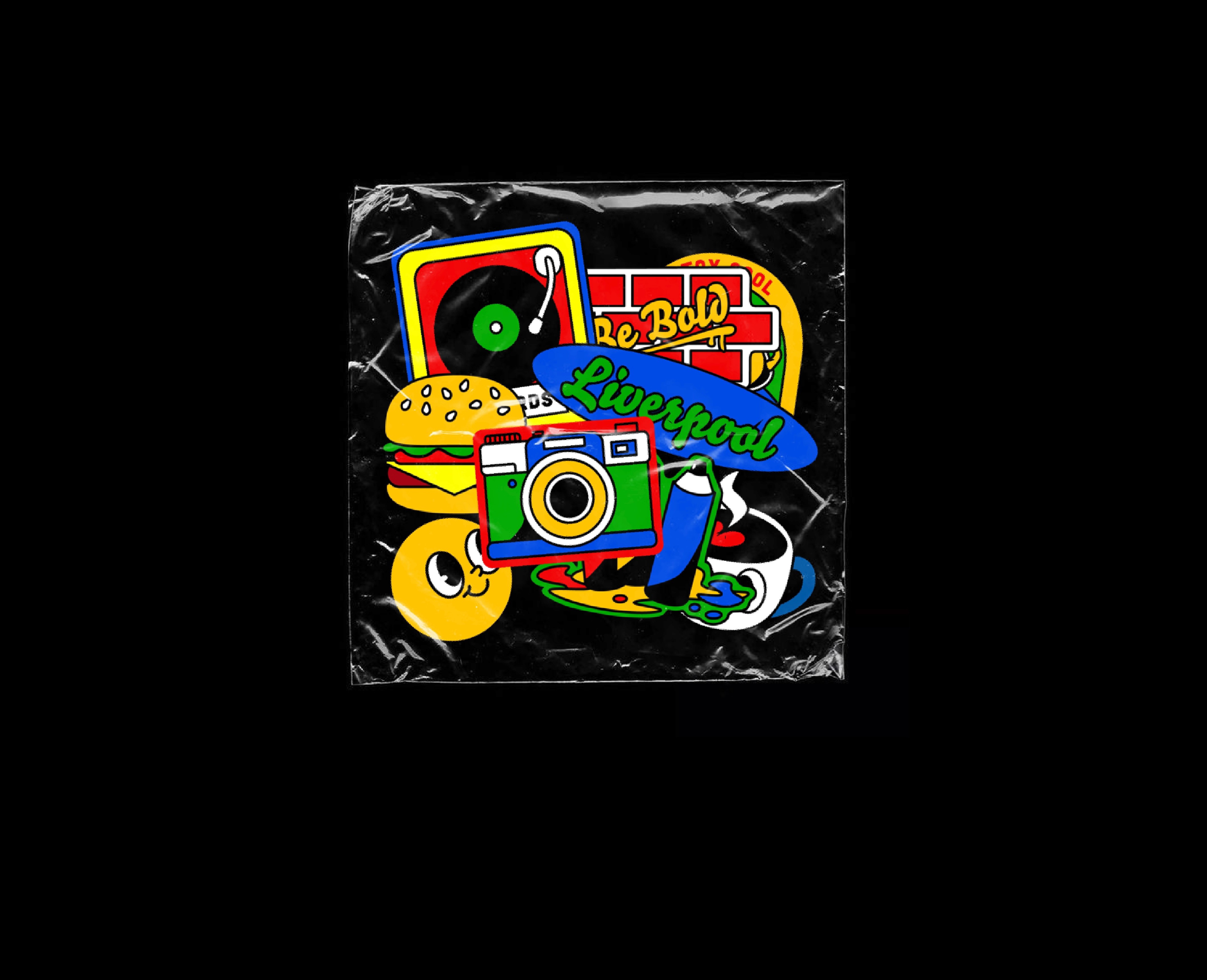
Ropewalks
A Liverpool Neighbourhood branding project
Brief
Ropewalks is an area in Liverpool, originally named for its history of rope-making for the sailing ships that dominated the area in the 19th century. It eventually evolved into a cultural hub, known for its independent shops, restaurants, bars, nightlife, and galleries.
In this conceptual project, a new brand identity was created to redefine the character of Ropewalks as a vibrant, energetic, and welcoming neighbourhood.
Concept
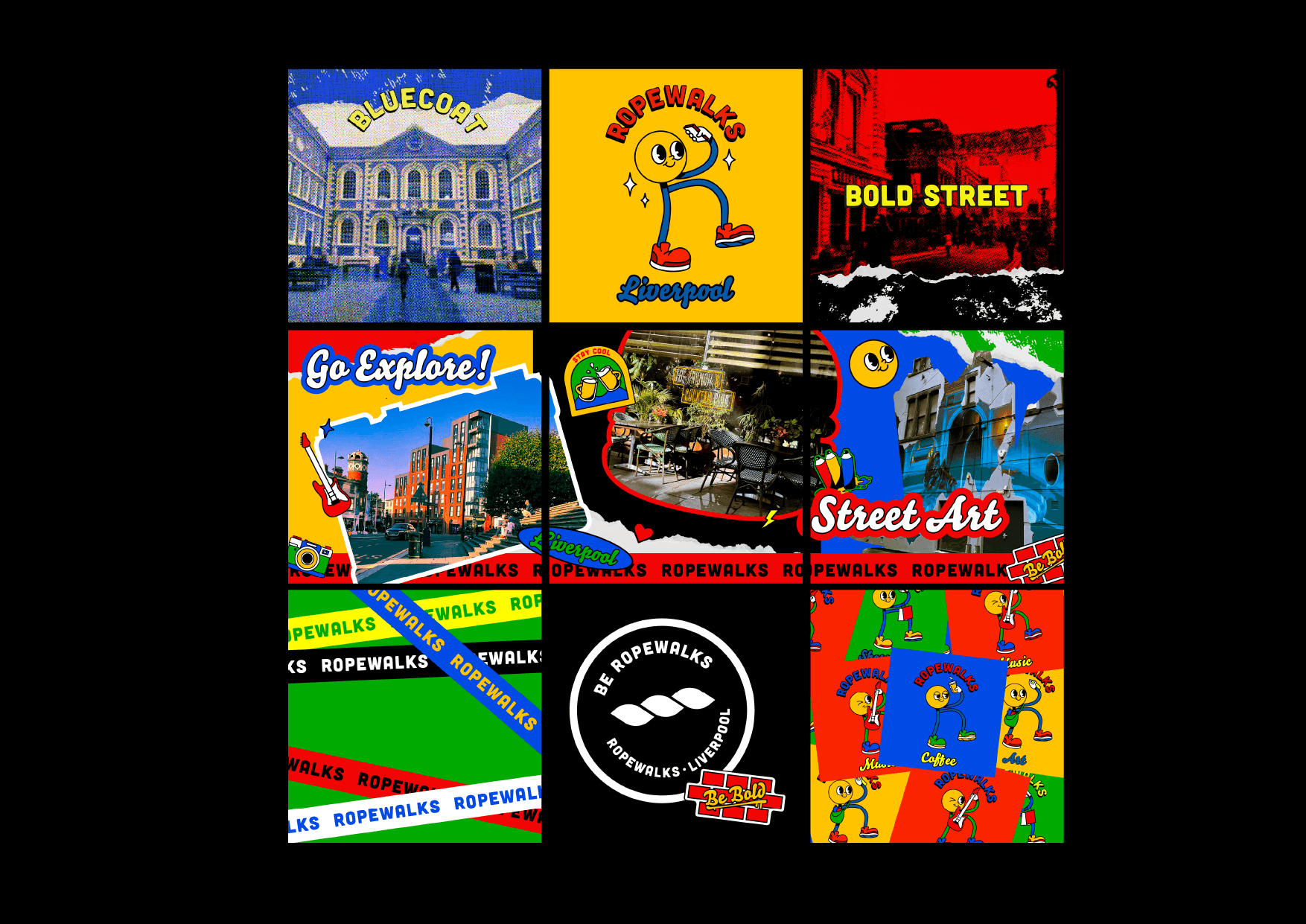
Ropewalks is a community-focused brand that inspires people to follow their passions—connect, share, and enjoy. It values open communication, using interactive and welcoming design to spark engagement. Its flexible visual system brings together individual shops and the wider neighbourhood, celebrating uniqueness while building a sense of community.
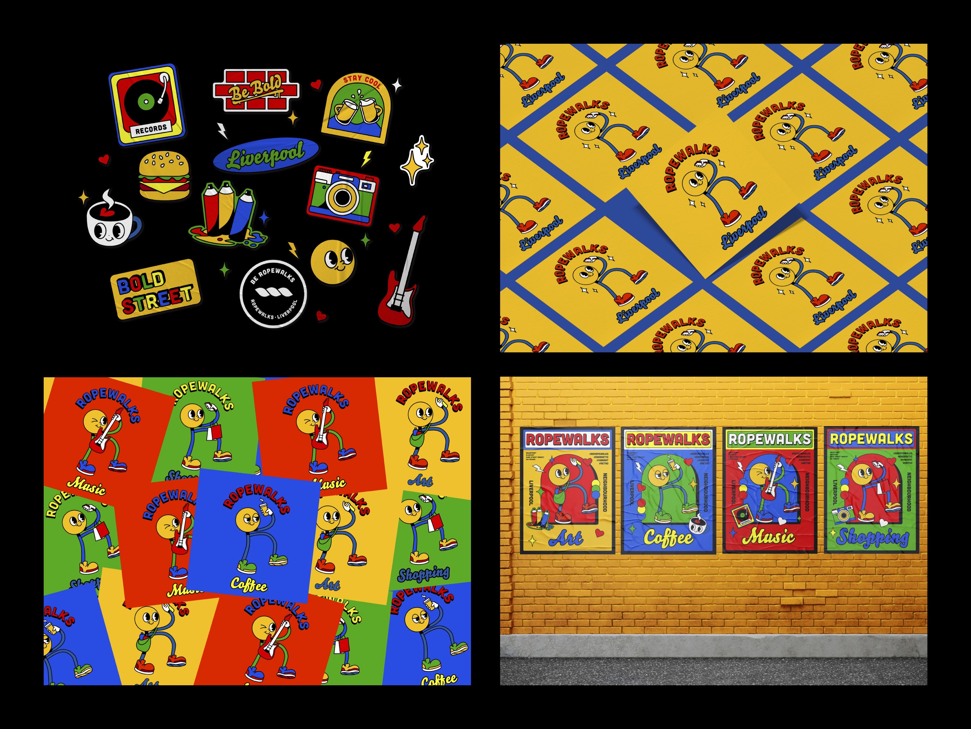
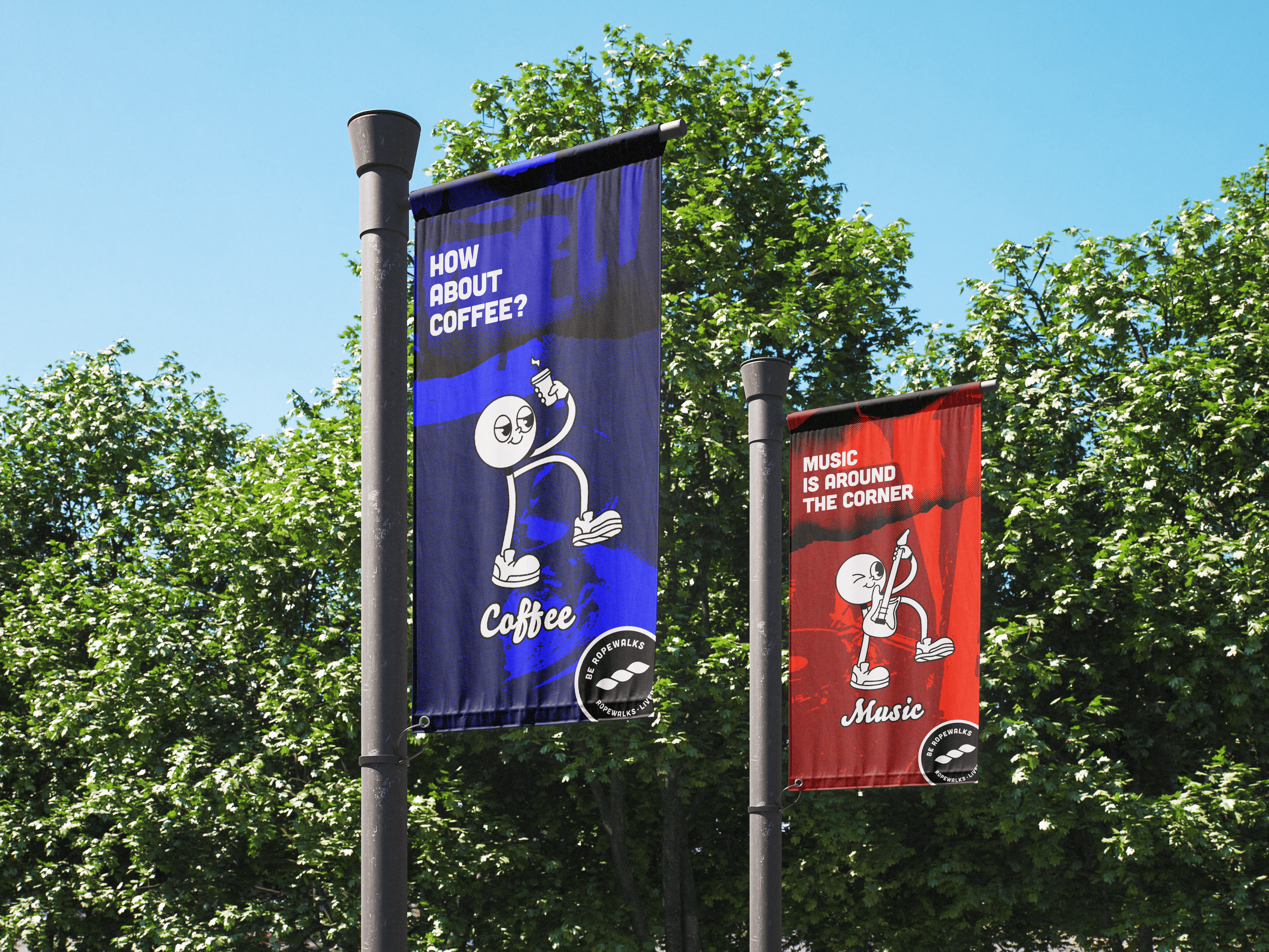
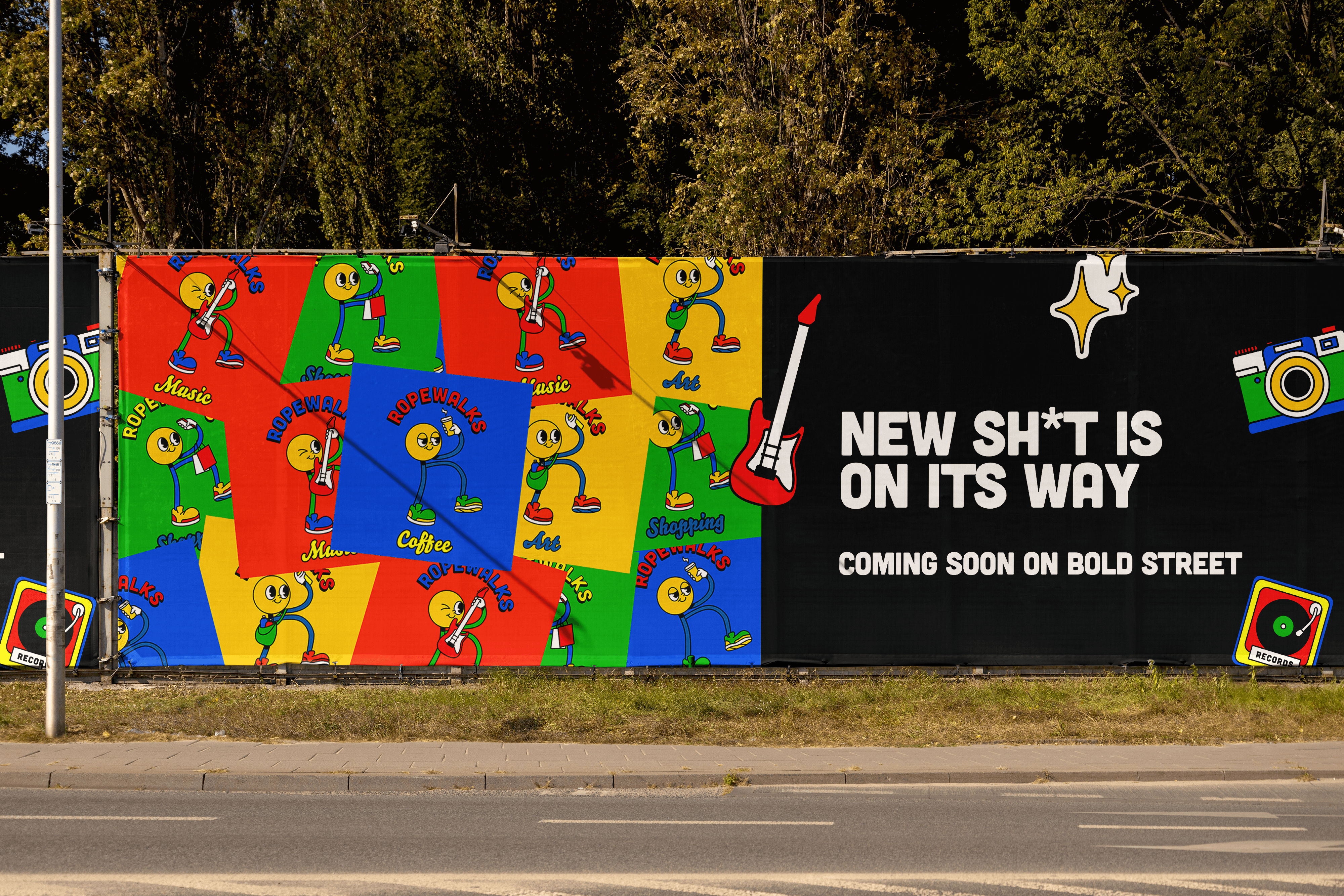
The brand uses a character shaped like the letter "R" to represent Ropewalks. The character appears in different sectors including shopping, art, and music—to highlight the area’s diversity and range of entertainment.
Skillsets
Illustrator
Photoshop
InDesign
Branding
Storytelling
Social Media
Visual Identity
Team & Roles
Solo Project by Rachel Leung


How can a visual identity reconnect people with a place they’ve learned to overlook?
Despite its rich history in rope-making, Ropewalks is often experienced as a fragmented neighbourhood, where its independent culture lacks a unified voice.
The challenge for this conceptual project was to give the area a brand identity that could hold both — one that felt rooted in place, but forward-facing enough to represent a neighbourhood defined by constant creative reinvention.
Therefore, we connects all the culture, spirit and life to one single character.
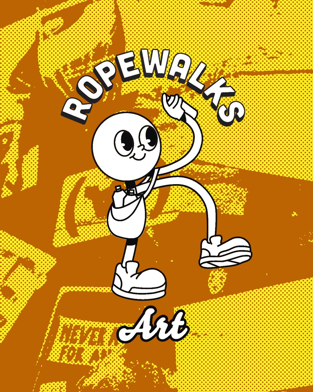
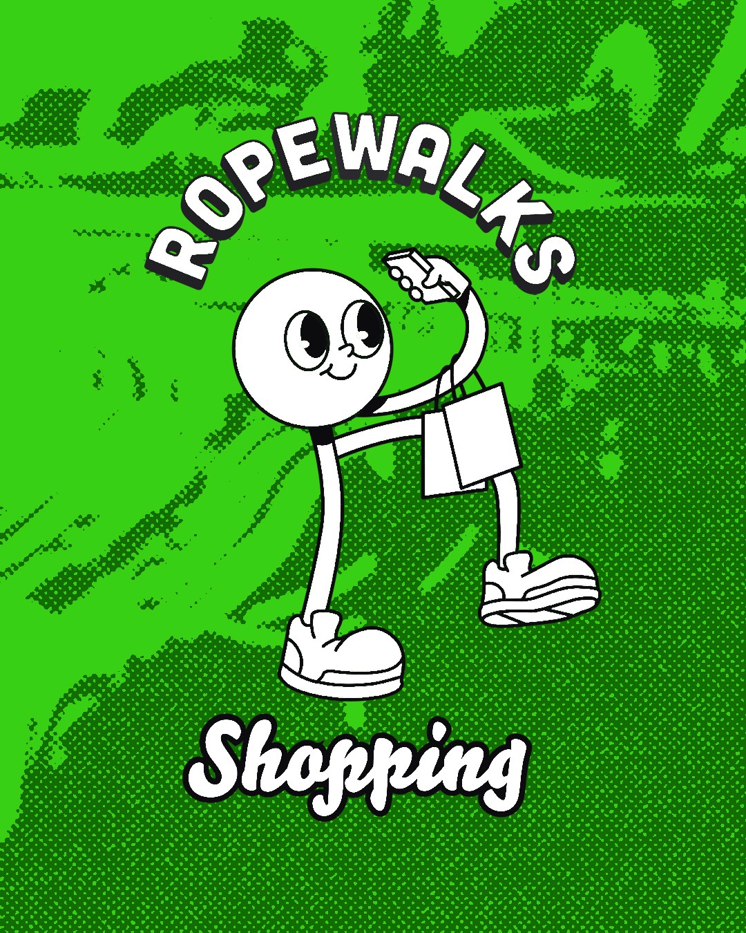
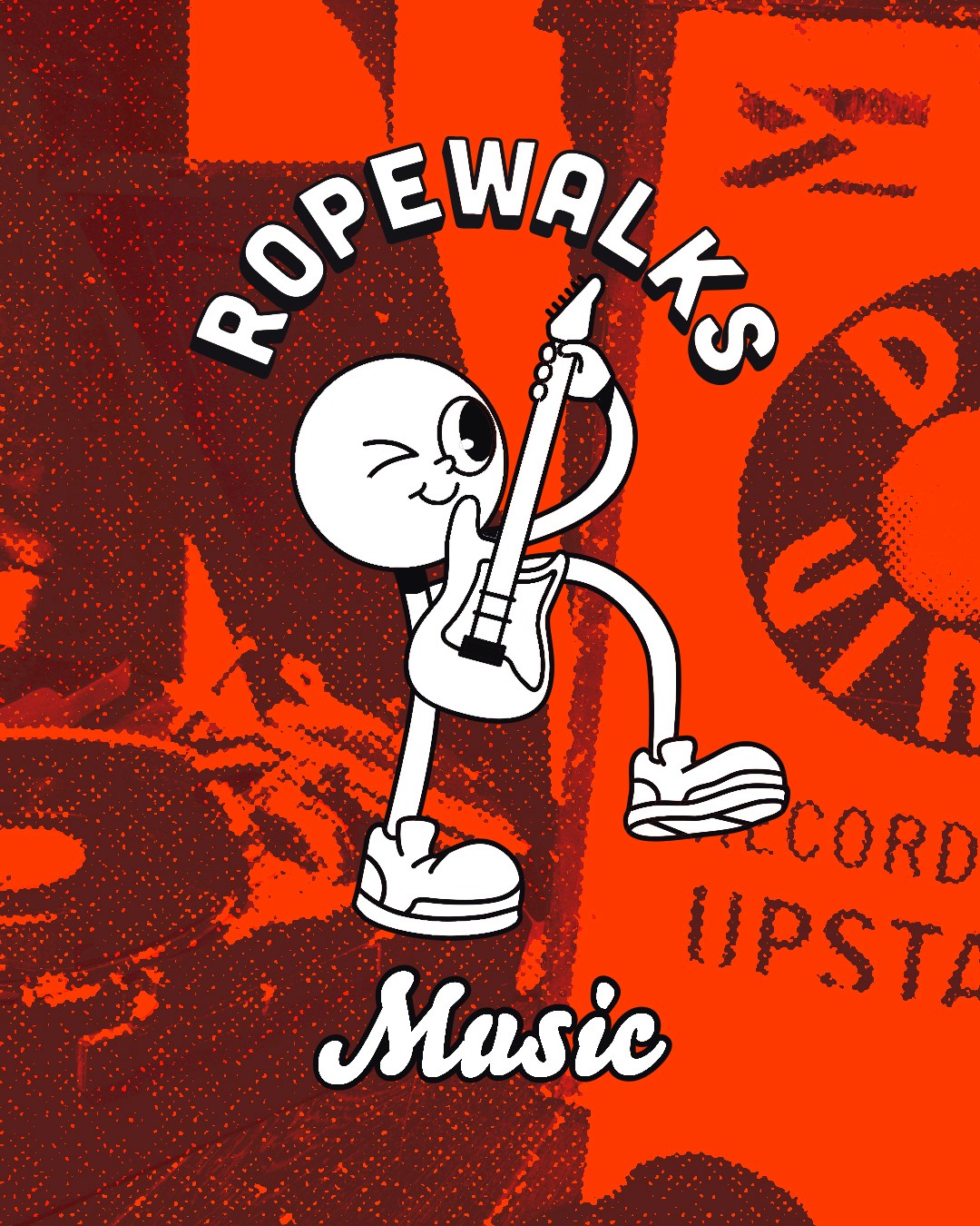
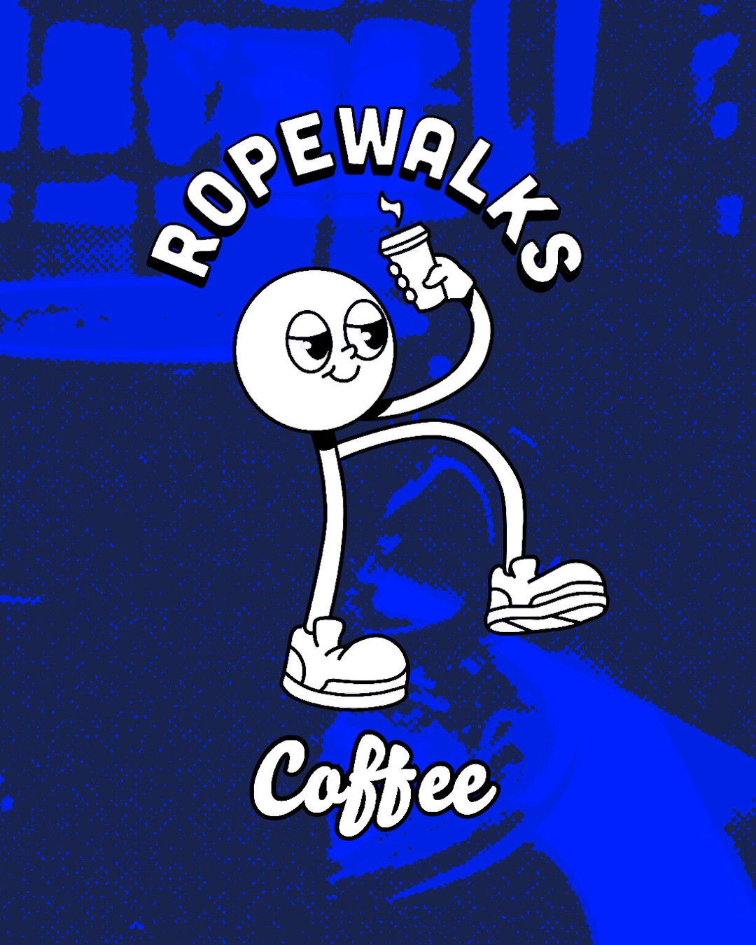
Rove
Rove is a character derived from the letter “R”, acting as a connector across Ropewalks.
Its flexible, tubular form is inspired by the movement of rope—stretching, linking, and adapting across different contexts.
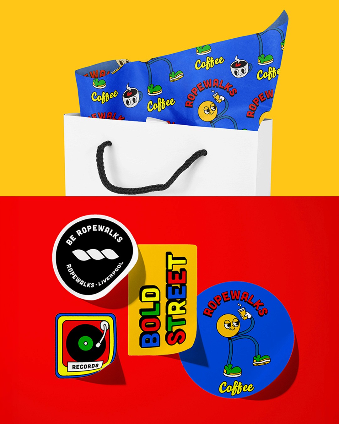
Appearing across music, art, and local businesses, Rove brings together diverse parts of the neighbourhood into a shared identity.
Single Destination -> Community system
Rather than branding Ropewalks as a single destination, I approached it as a community system — a neighbourhood built from dozens of independent, unrelated businesses that needed a shared visual language without losing their individual identities.
The brand is built around openness and participation: encouraging people to follow their passions, connect, and share, rather than positioning the neighbourhood as a finished, curated experience. This shaped a flexible visual system designed to unify the area's diversity rather than flatten it — celebrating each shop's uniqueness while still reading as one coherent neighbourhood.